Nike
Project
UI/UX, Employer Branding, Art Direction
UI/UX, Employer Branding, Art Direction
Role
Lead Designer
Lead Designer
Client
Nike
Nike
01 | Overview
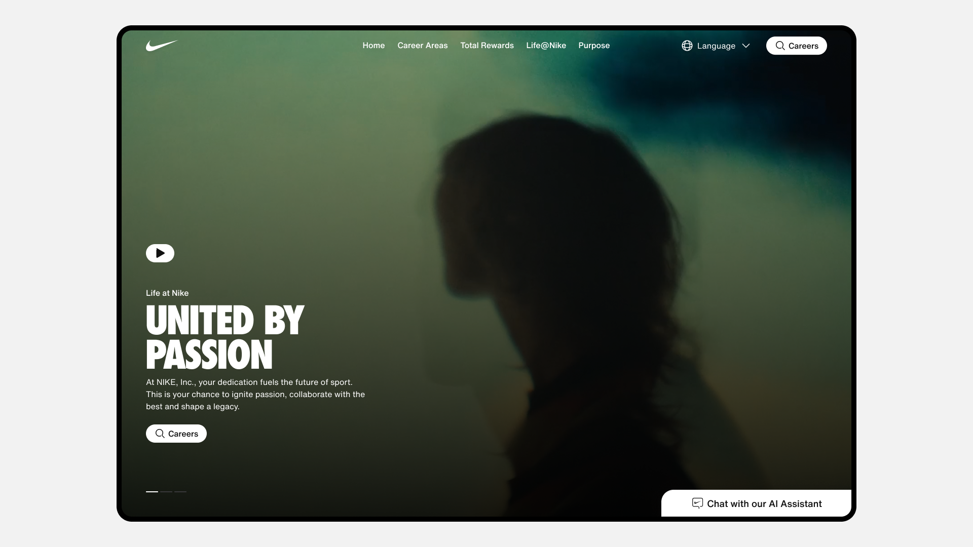
Reconnecting Candidates to the Brand
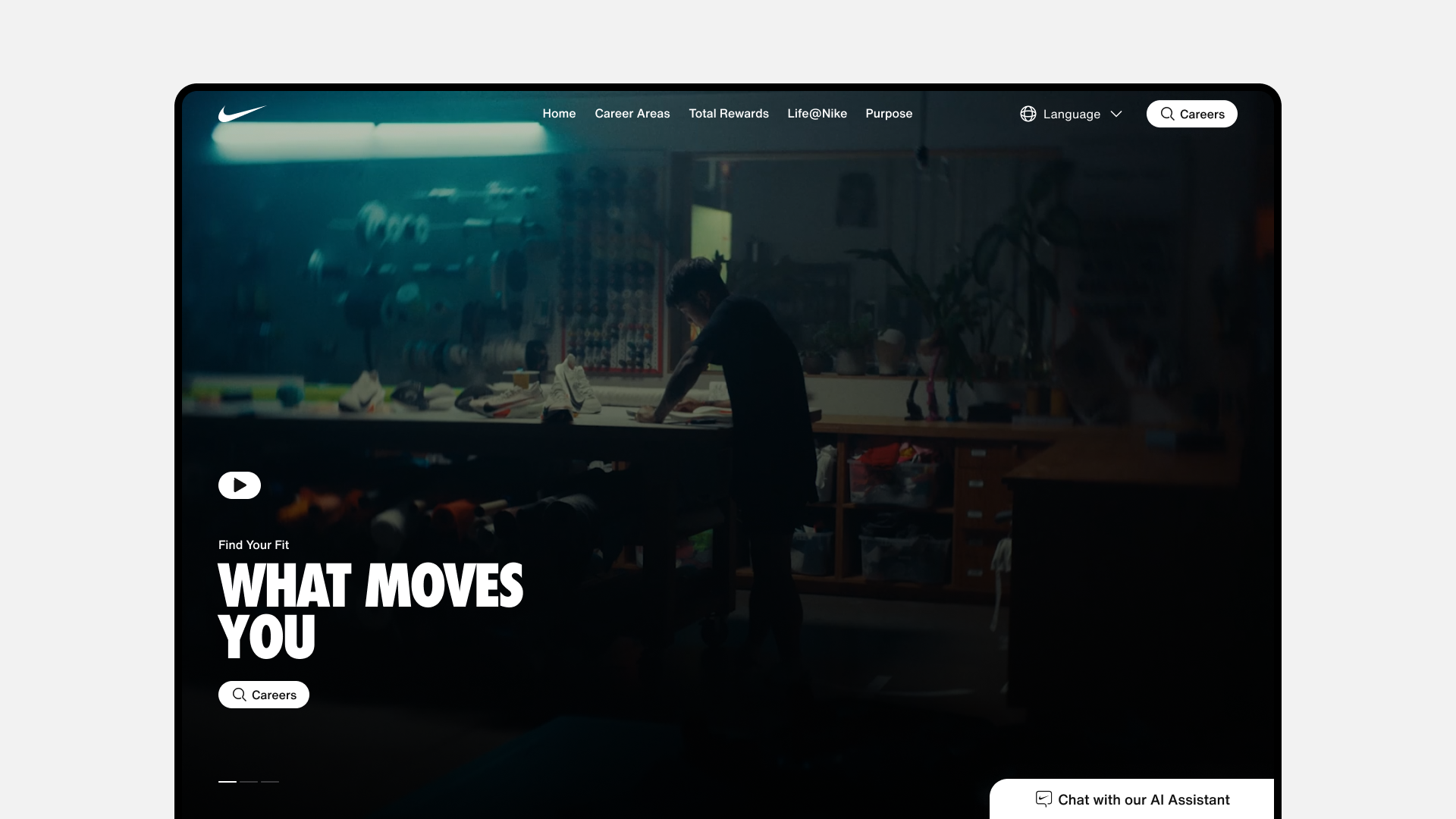
Nike's careers site had grown visually disconnected from the brand candidates already knew. Over time, the experience had become fragmented, out of step with nike.com, difficult to navigate, and particularly cumbersome on mobile, where the majority of traffic was arriving.
For a brand built on aspiration and identity, the gap between the consumer experience and the candidate experience was a real problem. Top creative and technical talent evaluating Nike as a workplace deserved the same level of craft they'd find anywhere else on nike.com.
02 | Scope
01
Mobile-first redesign that unified the careers site with Nike's broader Podium Design System
Mobile-first redesign that unified the careers site with Nike's broader Podium Design System
02
UI/UX design and prototyping in Figma, with testing across candidate navigation flows
UI/UX design and prototyping in Figma, with testing across candidate navigation flows
03
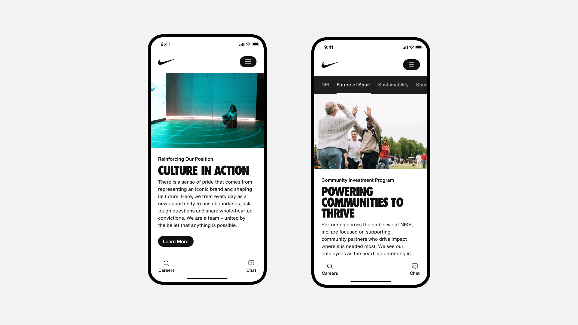
Art direction for visual language: imagery approach, layout, hierarchy, and brand tone
Art direction for visual language: imagery approach, layout, hierarchy, and brand tone
04
Cross-functional collaboration with internal Nike partners, external developers, and stakeholders
Cross-functional collaboration with internal Nike partners, external developers, and stakeholders
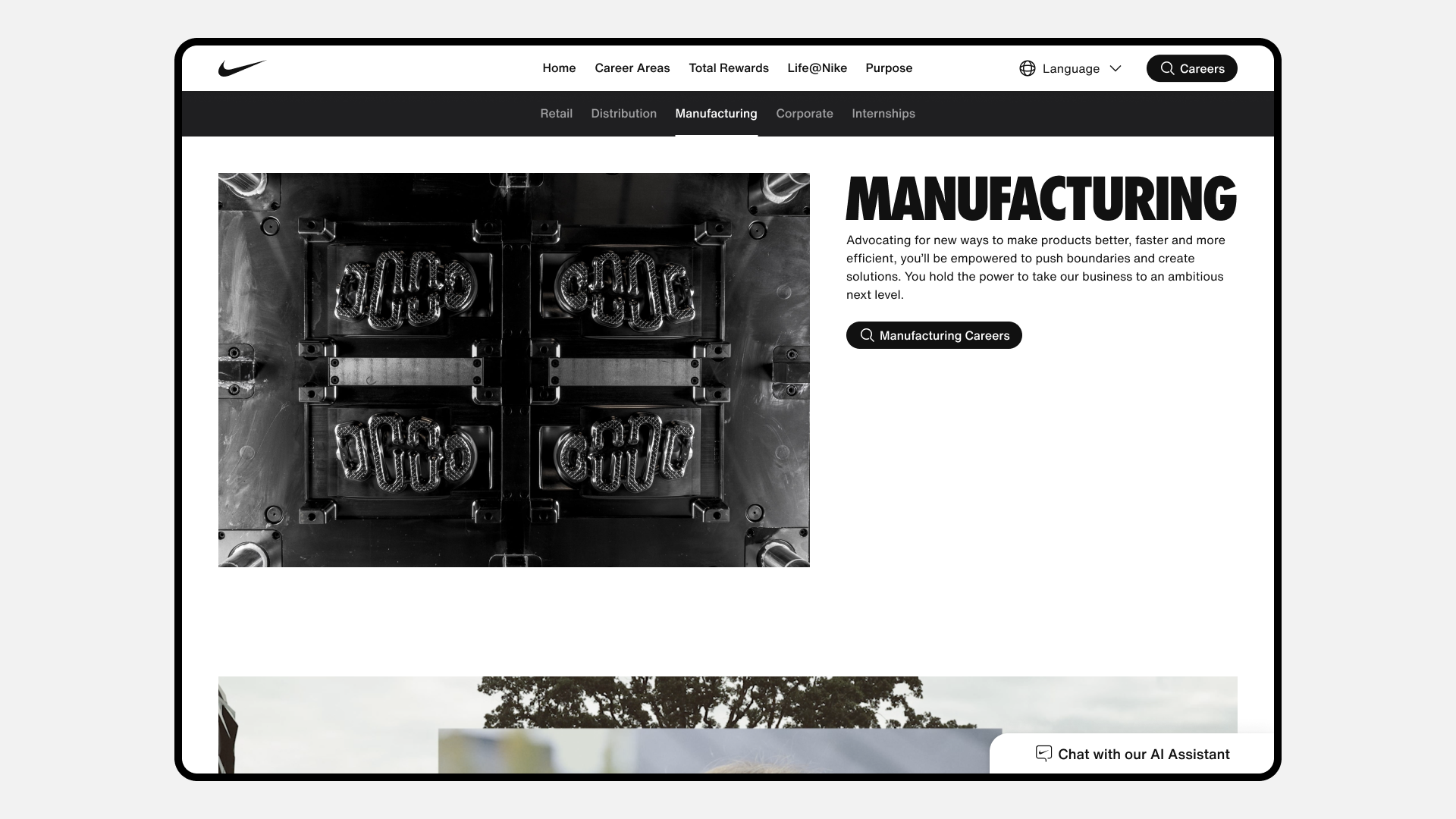
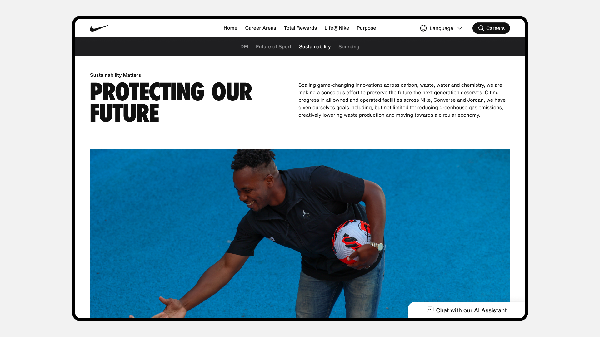
03 | Design
The redesign prioritized brand cohesion above all else. Every design decision, from typographic hierarchy to imagery tone to navigation structure, was made through the lens of Nike's existing consumer experience, using the Podium Design System as the connective thread between the careers site and the broader digital ecosystem.
04 | Mobile
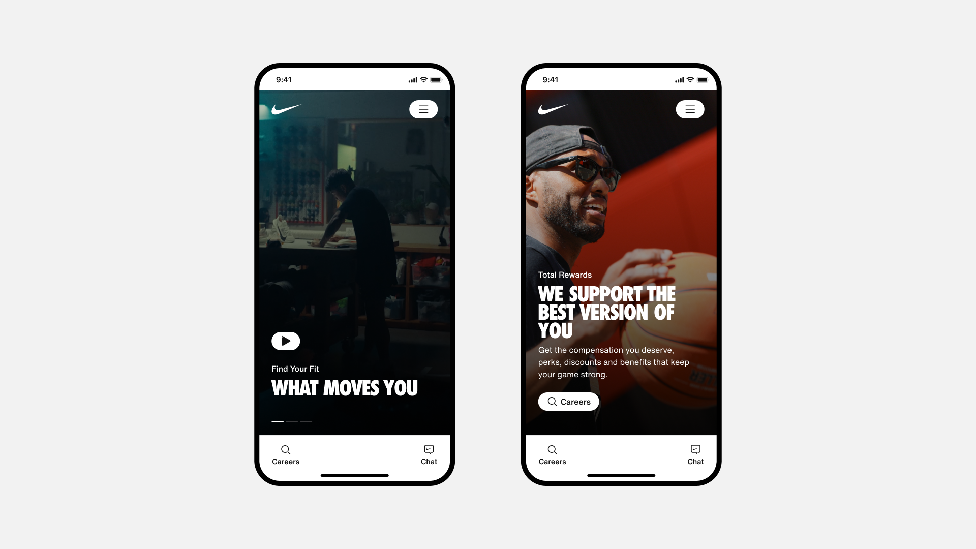
With the majority of site visitors arriving on mobile, the experience was designed mobile-first and adapted for desktop, not the other way around. Every touchpoint, from browsing roles to initiating the apply flow, was considered through the lens of a candidate on the go.
05 | Outcome
The redesigned careers.nike.com brought the candidate experience in line with the Nike brand for the first time, creating a site that felt like it belonged in the same family as nike.com, not apart from it.
Brand Cohesion
Internal stakeholders noted a marked improvement in how the careers site represented Nike's brand. For the first time, it felt continuous with the consumer experience rather than disconnected from it.
Internal stakeholders noted a marked improvement in how the careers site represented Nike's brand. For the first time, it felt continuous with the consumer experience rather than disconnected from it.
Candidate Clarity
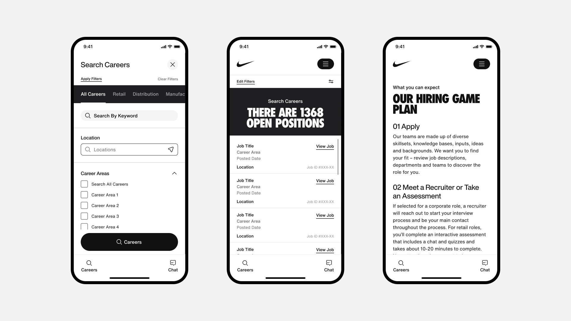
A simplified information architecture and streamlined navigation made it easier for candidates to find relevant roles and understand what Nike stood for as an employer, reducing friction in the early stages of the journey.
A simplified information architecture and streamlined navigation made it easier for candidates to find relevant roles and understand what Nike stood for as an employer, reducing friction in the early stages of the journey.
Mobile Accessibility
The mobile-first approach ensured that the majority of candidates, arriving on their phones, experienced a site built for them, not adapted for them as an afterthought.
The mobile-first approach ensured that the majority of candidates, arriving on their phones, experienced a site built for them, not adapted for them as an afterthought.