SummitStone Health Partners
Project
UI/UX, Employer Branding, Art Direction
UI/UX, Employer Branding, Art Direction
Role
Lead Designer
Lead Designer
Client
SummitStone Health Partners
SummitStone Health Partners
Agency
Bayard Advertising
Bayard Advertising

01 | Overview
A Brand That Finally Matched the Mission
SummitStone Health Partners has been serving people with limited access to behavioral and mental health care for decades, rooted in a mission that traces back to Robert F. Kennedy's push in the 1960s to care for the most vulnerable members of society. The founding spirit was still alive inside the organization. The problem was that none of it was coming through on the outside.
For an organization that depends on recruiting clinicians, therapists, case managers, and support staff who share its values, that gap had real consequences. The brand wasn't reflecting the depth of the mission or the distinctiveness of the culture. My role was to bring that culture to the surface, through visual design and UX, in a way that spoke directly to people wired the same way as the people already inside.
02 | Scope
01
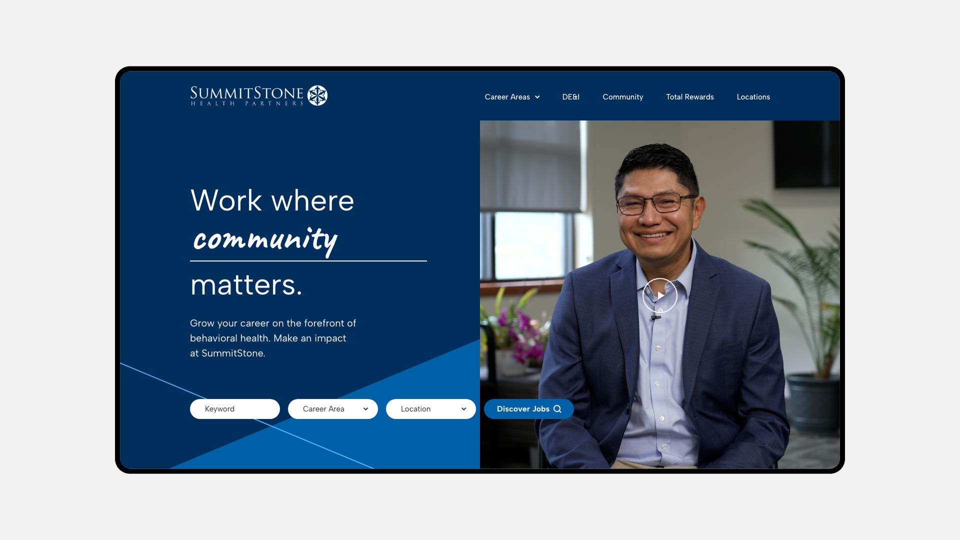
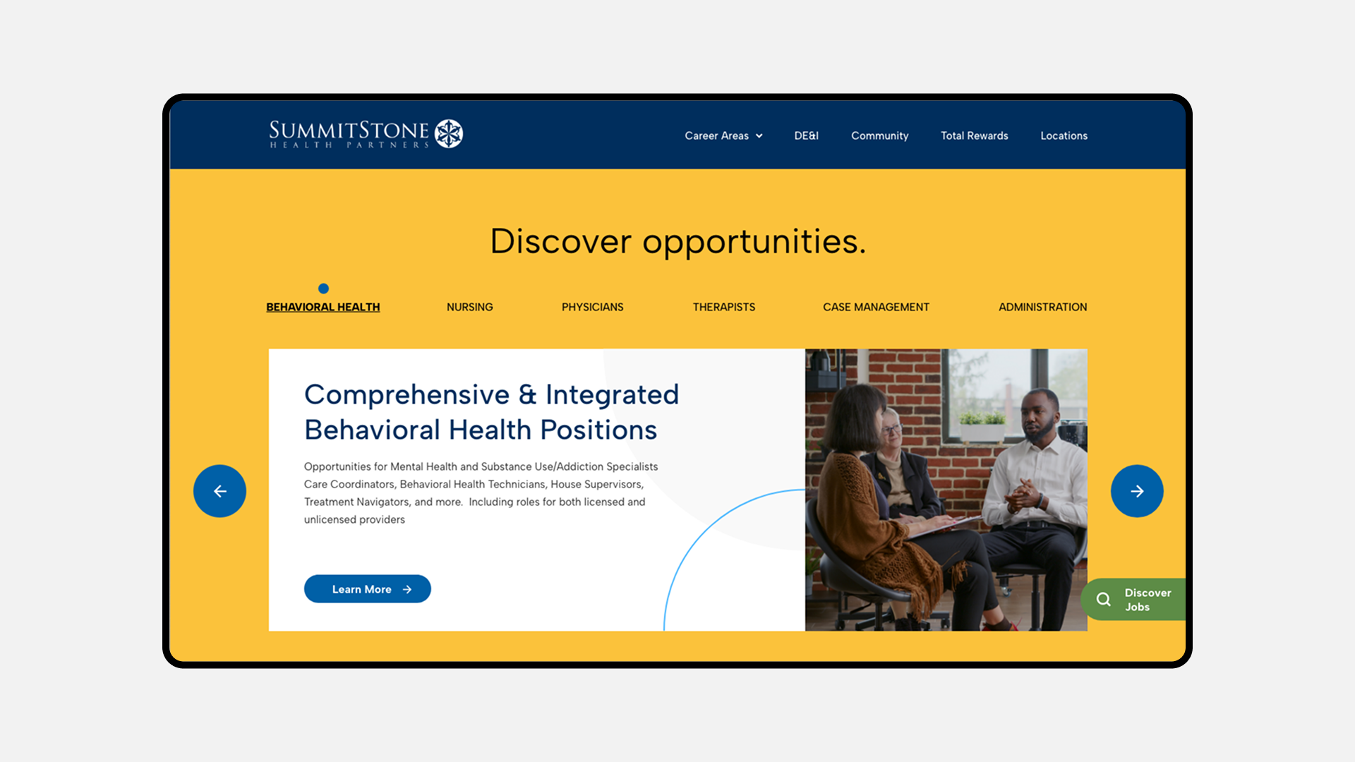
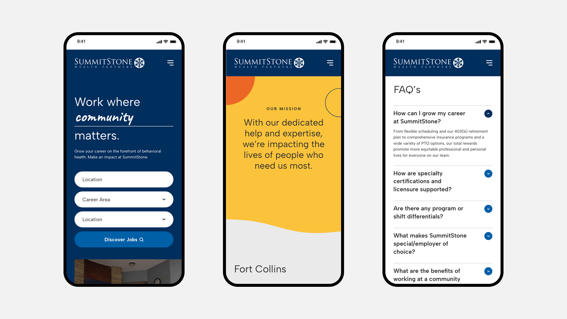
Full career site design: UI/UX and art direction for a DEI-forward candidate experience serving clinicians, therapists, case managers, and support staff
Full career site design: UI/UX and art direction for a DEI-forward candidate experience serving clinicians, therapists, case managers, and support staff
02
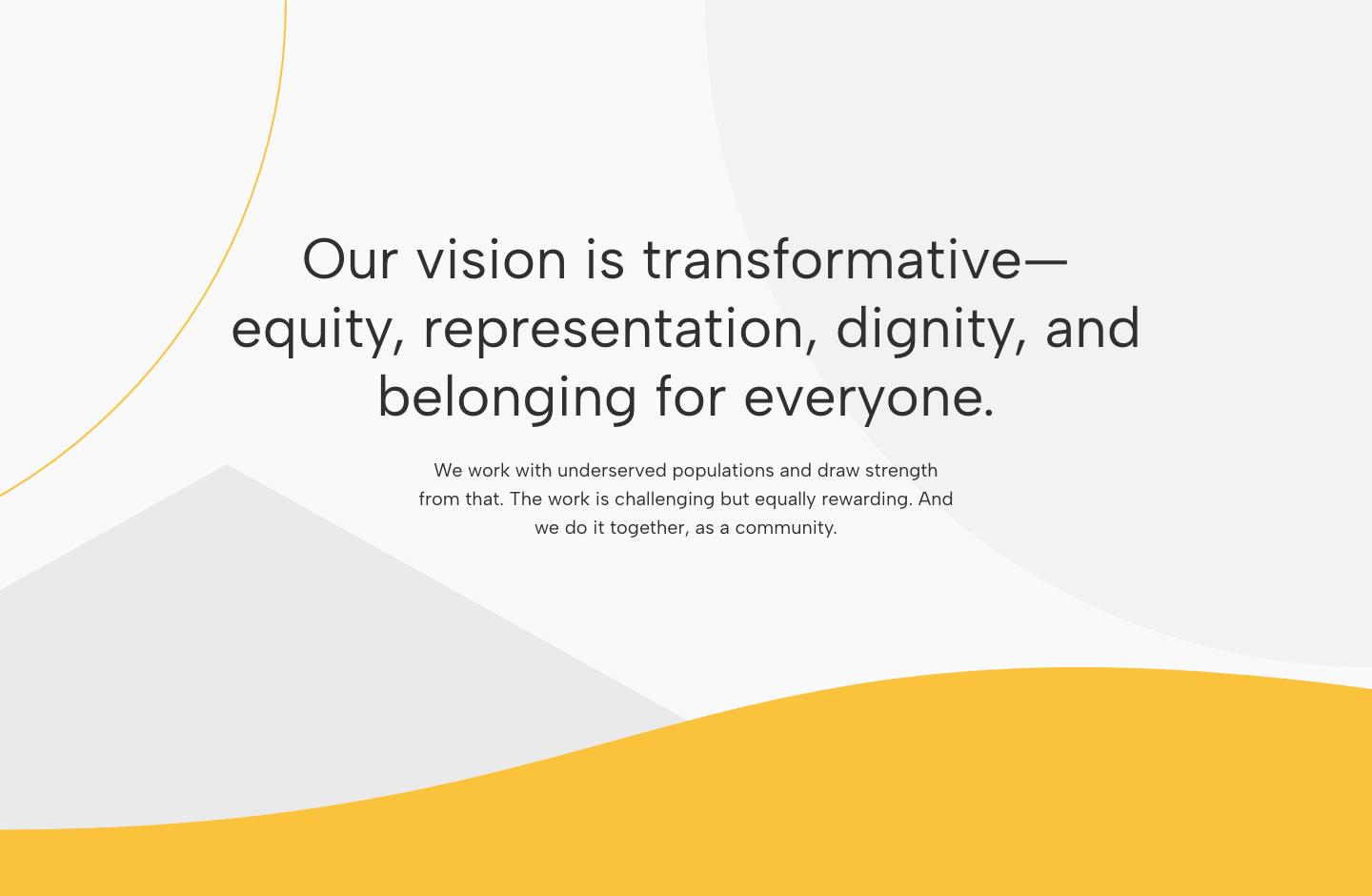
Visual identity expression: translating a rich, diverse color system and values-driven brand platform into a cohesive digital experience
Visual identity expression: translating a rich, diverse color system and values-driven brand platform into a cohesive digital experience
03
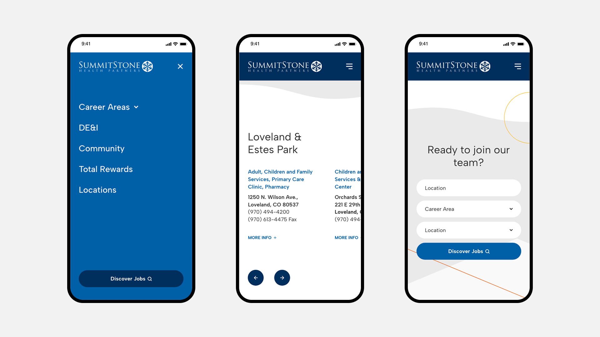
Mobile-optimized design and location-specific pages for SummitStone's facilities across Northern Colorado
Mobile-optimized design and location-specific pages for SummitStone's facilities across Northern Colorado
04
Total rewards section and content architecture designed around a values-driven audience, not a generalist job seeker
Total rewards section and content architecture designed around a values-driven audience, not a generalist job seeker
05
Brand collateral suite: digital display ads, recruitment banners, and presentation cards extending the employer brand beyond the career site
Brand collateral suite: digital display ads, recruitment banners, and presentation cards extending the employer brand beyond the career site
06
Consistent visual system applied across all touch-points to ensure the brand showed up with the same warmth and clarity in every candidate-facing format
Consistent visual system applied across all touch-points to ensure the brand showed up with the same warmth and clarity in every candidate-facing format
03 | Design
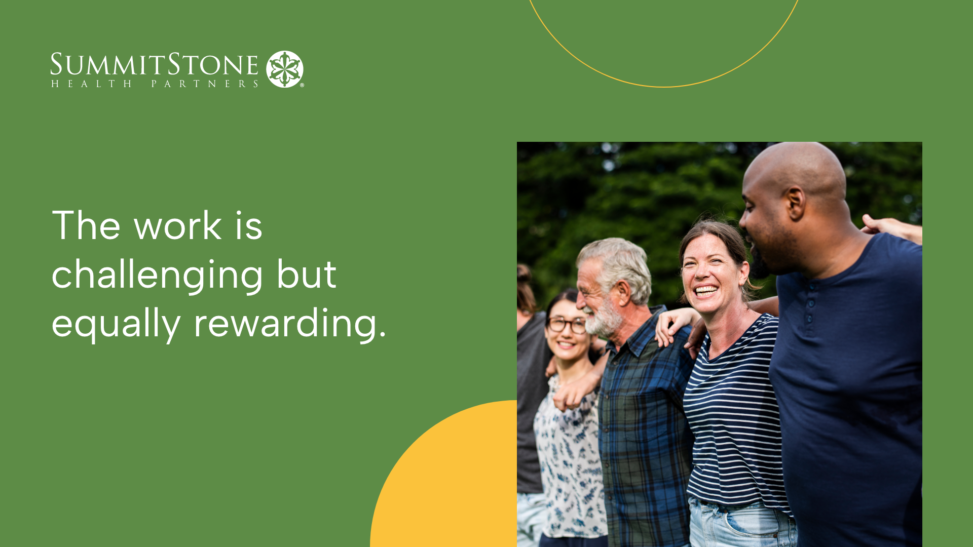
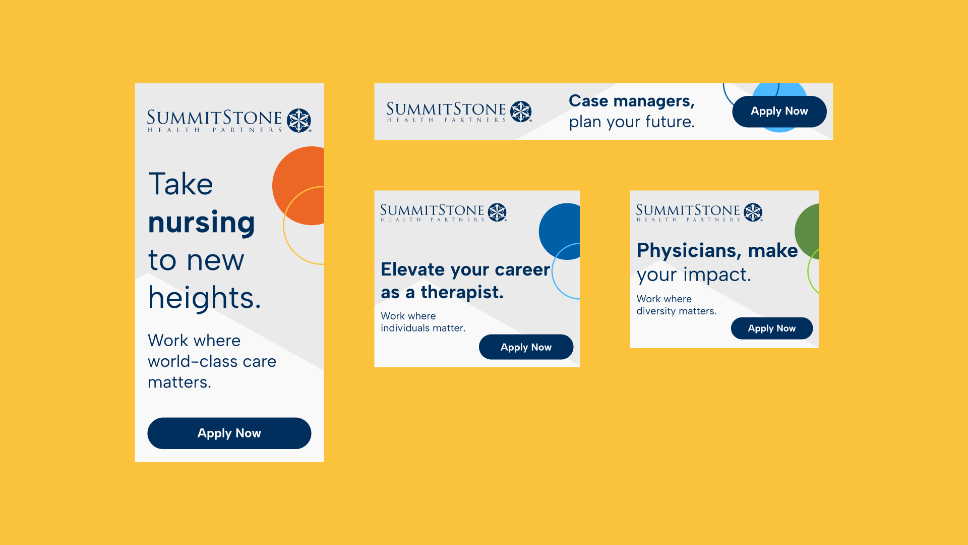
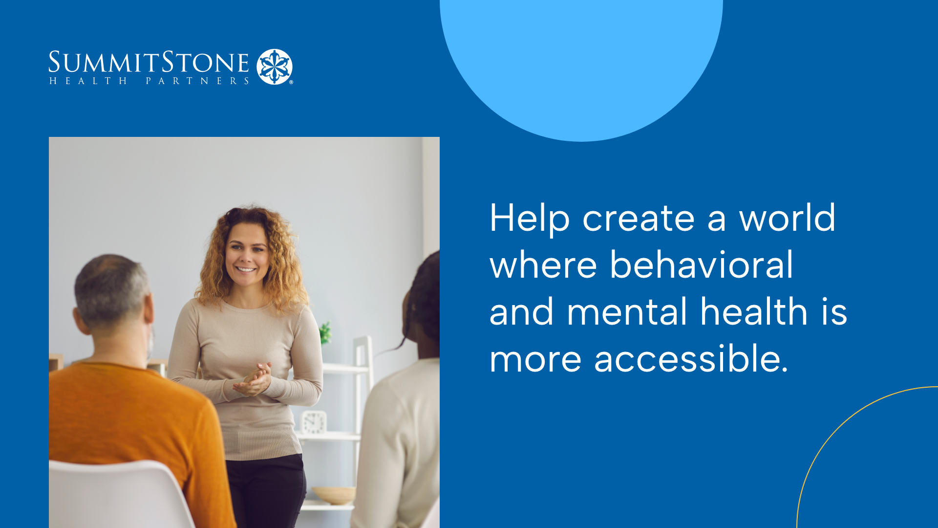
The visual language was a deliberate departure from the clinical blues and greens that dominate behavioral health recruiting. A rich, warm color system, built around real diversity and warmth rather than the performative version, signaled immediately that SummitStone wasn't a typical healthcare employer. Every design choice was in service of that signal: this is a place where your convictions aren't just welcome, they're the point.
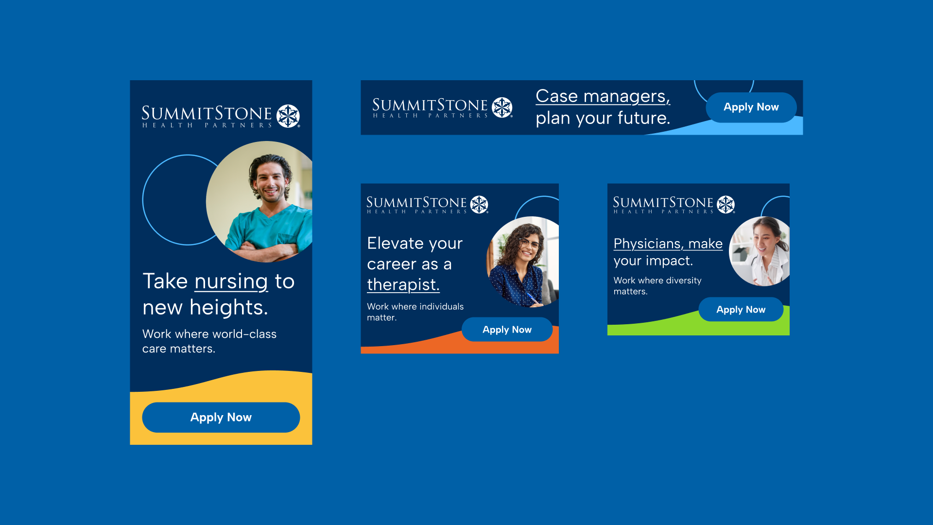
04 | Brand Collateral
The employer brand didn't stop at the career site. A suite of brand collateral, including digital display ads, recruitment banners, and presentation cards, extended the visual system into every touch-point a candidate might encounter. The same color warmth, typographic voice, and values-forward tone carried through each format, ensuring the brand felt intentional and consistent whether someone was seeing it on the site or in a digital ad.
05 | Mobile
With candidates spread across Northern Colorado and an audience that skews mobile-first, the experience was designed and optimized for smaller screens from the start. Location-specific pages gave each SummitStone facility its own presence, making it easier for candidates to connect with the specific community they'd be working in.
06 | Outcome
The work gave SummitStone a brand presence that finally matched the seriousness and depth of its mission, alongside a career site that held up long after launch as a platform the organization could build on.
Mission Made Visible
For the first time, the SummitStone employer brand reflected the depth and distinctiveness of its internal culture, giving purpose-driven candidates a clear signal that this organization operated differently from the start.
For the first time, the SummitStone employer brand reflected the depth and distinctiveness of its internal culture, giving purpose-driven candidates a clear signal that this organization operated differently from the start.
Audience Alignment
A visual system and content architecture built for the values-driven candidate rather than a generalist job seeker, making it easier for the right people to recognize themselves in the brand before they ever applied.
A visual system and content architecture built for the values-driven candidate rather than a generalist job seeker, making it easier for the right people to recognize themselves in the brand before they ever applied.
Lasting Platform
The site remained live and in active use for years after launch, a signal that the design work was built to hold up, not just to impress at launch.
The site remained live and in active use for years after launch, a signal that the design work was built to hold up, not just to impress at launch.